Data Dashboard

What is the TRAFIG data dashboard?
The TRAFIG data dashboard is a visual toolbox to provide first insight into the findings of our TRAFIG survey data on the conditions, trajectories and networks of protractedly displaced persons. The MCM data panel displays the degree of displaced persons’ mobility, their network connectivity and their marginalization, which we use as proxy for protracted displacement. For each of these 3 dimensions 8 key indicators reflect the respondents’ answers to a set of relevant survey questions. The global networks and trajectories maps display the ego-centric networks (with up to 5 key contacts) of our survey respondents as well as the displacement journeys to their current place of living. The data dashboard is our project deliverable D7.2 for an interactive online tool.
How can I use the TRAFIG data dashboard?
We want people to make use of our data dashboard and it's features and we know that online tools sometimes can be difficult to handle. Also, in an extensive study like TRAFIG the interpretation of data is not trivial, especially as we created indicators for measurement. That is why we came up with a quick tutorial that demonstrates how to use the TRAFIG data dashboard. Take a few minutes to see the video and optimally use the graphics.
What is the database of the TRAFIG data dashboard?
The data dashboard is based on a dataset that consists of 1897 survey interviews collected in 6 countries – the TRAFIG survey. We transferred the interview answers into usable data, working with binary variables (yes/no), categorical variables (single-/multiple-choice), metric variables (numerical values) as well as open text variables such as locational information. The full data set is not yet publicly available. It will, however, be made accessible via the open repository Zenodo.
Why did we conduct the TRAFIG survey?
We collected survey data to triangulate and underpin findings obtained through qualitative research (i.e., semi-structured, biographic and expert interviews, focus group discussions) and to test TRAFIG’s central hypothesis. We make use of the survey data in our working papers and academic articles and used it to develop a unique set of indices and indicators on displaced persons’ degree of connectivity, mobility, and marginalisation.
Where and when was the survey conducted?
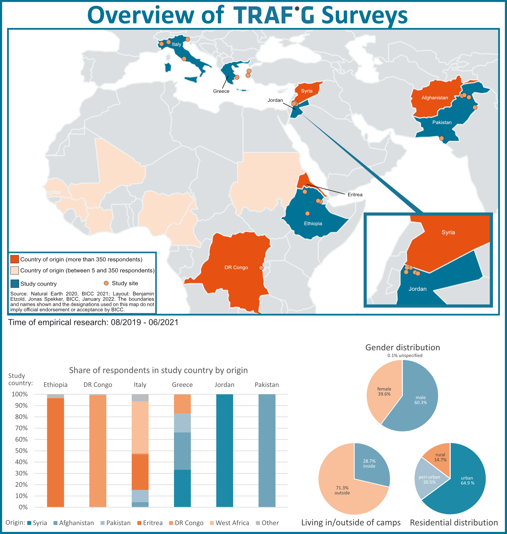
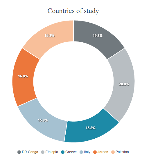
The survey has been conducted at diverse sites in 6 countries, in which hundreds of thousands of persons live under conditions of protracted displacement, and where we have also conducted qualitative research: Pakistan, Jordan, DR Congo, Ethiopia, Italy, and Greece. To obtain sufficient information from all focus regions, the survey took place from February 2020 to June 2021. Detailed information can be seen in the following overview map.
Click to see the full-size graphic!
Who did we talk to?
In total, 1897 persons participated in the survey, 300 or more displaced persons in each country. Survey respondents are 16 years+ people who have been or are potentially affected by protracted displacement. 60% of the participants are male and 40% female. Respondents have been born in a range of countries, most in Eritrea (25%), Syria (21%), Afghanistan (20%), the DR Congo (19%). An overview of key variables of the sample according to the country of the study is available in this document.
Who conducted the survey?
The survey interviewers were carried out by researchers, who also conducted qualitative research at the study sites, or by enumerators, many of whom from the respective migrant communities, who were specially trained for this purpose. The survey implementation was led by ULEI in the DR Congo, AAU in Ethiopia, YU in Jordan, SHARP in Pakistan, AUTH in Greece, and FIERI in Italy. In an insightful blog contribution, the survey team in Italy have shared their experience of doing field research during the pandemic.
What have we asked?
We asked respondents a variety of questions on the reasons for their mobility, their displacement journey, return and onward mobility (intentions); on their current living conditions and their perception of social inclusion or marginalization at the place where they now stay; on the existence, spatial dimension and quality of their network relations; and on the effects of the COVID-19 pandemic on their lives. The full questionnaire can be seen in this document. It was conducted on mobile devices via Kobo Toolbox, an online tool for interviews and data management.
How did we handle sensitive information?
Based on the highest international standards, we developed ethical guidelines for empirical research in the TRAFIG project. The enumerators informed the participants about the goals of the survey and asked them for their oral informed consent. Sensitive personal data such as names or addresses was not collected. Most questions were closed. Locational information (place of origin, journey, site of network contacts) can only be displayed at a higher level (admin 1 – the regions within the country).
Who is behind the TRAFIG data dashboard?
The data dashboard has been developed by a small team of researchers and student assistants at BICC (Bonn International Centre for Conflict Studies) on the basis of the TRAFIG survey data. Benjamin Etzold developed the survey questionnaire, led the survey implementation, for which the country teams of TRAFIG partners where responsible, indicator construction and data analysis. Rolf Albert and Lars Wirkus developed the data management landscape based on the KoBo-toolbox and an internal cloud-server. Ben Buchenau supported the data cleaning, data processing, data analysis, and indicator construction, and then developed the tools included in the data-dashboard in collaboration with Rolf Alberth. For the visualization, ApexCharts and Plotly libraries have been used. Rolf Alberth integrated the dashboard on the TRAFIG website, which runs with GRAV. For any questions regarding any of these processes, please approach us via contact@trafig.eu.